A company priding itself on giving their customers a fresh start
(PULP)
PULP Juice and Smoothie Bar approached this rebrand with a clear mission, to strip back the noise and rediscover what made them stand out in the first place: authenticity, freshness, and a genuine connection with their customers. They wanted something real, unfiltered, raw, and honest, a brand that felt like a fresh start, both for the business and for everyone who walks through their doors.
As the designer on this project, my goal was to translate that vision into a visual identity that felt human and approachable, while still being bold and full of energy. The rebrand needed to move beyond surface-level aesthetics and capture the essence of PULP, a brand that celebrates real ingredients, real people, and real moments.
One of the main challenges in rebranding PULP Juice and Smoothie Bar was finding a way to visually express their “raw and unfiltered” personality without losing clarity or approachability. PULP needed a brand identity that felt grounded and real, while still capturing the vibrancy and optimism that define their products.
One of the main challenges in rebranding PULP Juice and Smoothie Bar was finding a way to visually express their “raw and unfiltered” personality without losing clarity or approachability. PULP needed a brand identity that felt grounded and real, while still capturing the vibrancy and optimism that define their products.
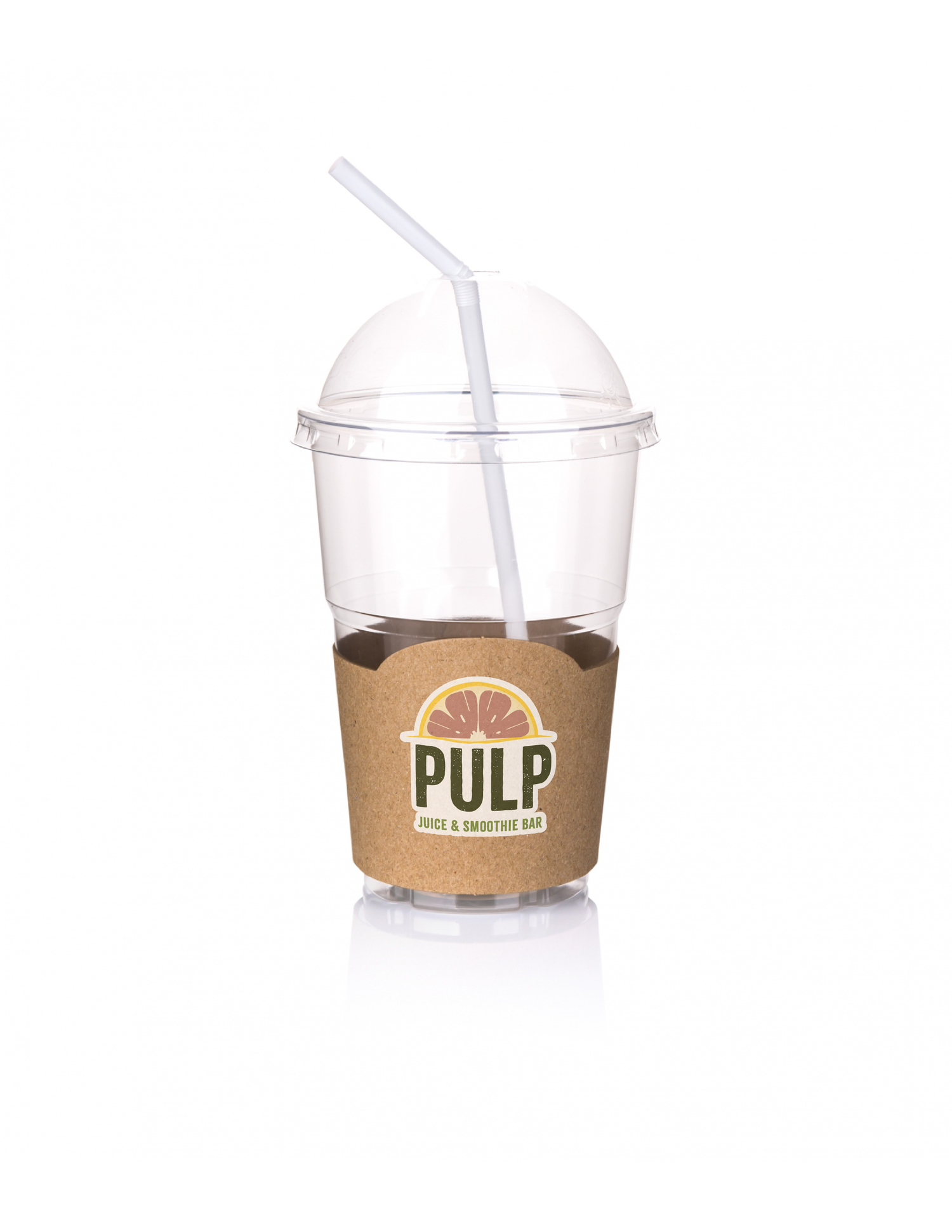
To tackle this, I focused on using a visual metaphor that embodied the brand’s core message of growth and renewal. The concept of a sunrise became central, a symbol of fresh starts, new energy, and the promise of something better. This idea was then merged with one of PULP’s signature ingredients, the grapefruit, known for its bold flavor and natural brightness. The result was a distinctive logo mark where the grapefruit subtly doubles as a rising sun, a visual representation of PULP’s commitment to authenticity and fresh beginnings.
This design direction informed every part of the brand system, from the color palette inspired by sunrise hues to the organic textures and imperfect lines that kept the visuals feeling human and unfiltered. The outcome was a visual identity that not only stood out in a crowded market but also reflected the heart of PULP’s renewed story: real, raw, and ready for a fresh start.


The rebrand culminated in a dynamic identity centered around the grapefruit-sunrise symbol. This visual metaphor became the anchor for the brand, adaptable across packaging, signage, digital touch points, and in-store environments.
The refreshed identity gives PULP a distinct voice in a crowded market, one that feels confident, honest, and human. It resonates with customers who value authenticity, while offering a cohesive visual system that can scale as the brand grows.
Ultimately, this project was about more than aesthetics. It was about creating a visual identity that mirrors PULP’s purpose: to offer something real, raw, refreshing, and full of life. The result is a brand that feels like a breath of fresh air, standing proudly apart from competitors and inspiring customers to start fresh, one sip at a time.